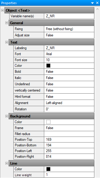
Details on the Properties Section
Information about the Properties section in the Print layout editor.
As soon as you have selected an object in the editor, the properties of this object are displayed here.
You are here:
Object
- <Text> = Text
- <Image> = Graphic
- <Rect> = Rectangle
- <Line> = Line
Variable name(s)
Text fields containing variables are filled by the program with the value assigned to the variable. If the Variable name(s) field contains the value STATIC, the text field displays the specified value of the associated Labeling field.
If LINEAR variables are to be used, the variable name has to be written in capital letters and inserted into the Labeling field.
General
Fixing
Aligns the text of a text box to the upper or lower edge of the frame. The Free (without fixing) setting is the recommended default setting and is especially suitable for dynamic texts (coming from variables). This setting is only visible when a correspondingly set print layout is printed.
Adjust Size
This setting is only visible when a correspondingly set print layout is printed.
True: Adjusts the size of the text box to fit the text it contains. The prerequisite for this function is that the text is not vertically centered.
False: Text that extends beyond the text box is cut off.
Text
In this section you will find all settings for displaying the text in the selected object.
| Field name | Description |
|---|---|
| Labeling | If the STATIC setting is used for the variable name, the text from this field is output in the print layout. |
| Font, Font size, Color | You can select the desired font from a drop-down list, enter the desired font size, and specify the desired text color from a set of predefined colors. Clicking the three dots in the color palette opens another window where you can specify custom colors. |
| Bold, Italic, Underlined | Font style for the text in the selected object. |
| Vertically centered | True: Text will be centered vertically within the text box. False: Text placed in the upper left corner of the text box. |
| Html-Format | True: Allows you to print text in sub- and/or superscript. The |
| Alignment | Horizontal alignment of the text in the text box. |
| Rotation | Rotates the text in the text box clockwise by either 0°, 90°, 180°, or 270°. The text frame is not rotated. |
Background
In this section you will find the settings for displaying the background of text boxes or rectangles.
| Field name | Description |
|---|---|
| Color | Opens a color palette with a set of predefined colors. Clicking the three dots in the color palette opens another window where you can specify custom colors. |
| Frame | True: The text field will be displayed with a frame. |
| Fillet radius | The corners of rectangles can be rounded off. Value to be entered manually. |
| Position-Top/-Bottom/-Left/-Right | You can manually set the position of the upper, bottom, right, and left edges of a frame. |
Line
In this section you define the appearance of lines, frames, text boxes and rectangles for the currently selected object.
Color
Opens a color palette with a set of predefined colors. Clicking the three dots in the color palette opens another window where you can specify custom colors.
Line weight
Manually entered thickness of a line or a frame.
Image
Path
The file path to the currently selected image. The path can be adjusted manually, for example, to exchange an image.
Stretch mode
Fit: The image is proportionally enlarged or reduced when the frame size changes. The image is not distorted.
Stretch: The image adjusts to the width and height of the frame when the frame size changes. The image can be distorted.